There are many ways to present the list of modes being estimated. In the Mode List the natural frequency and damping ratio estimates are listed in tabular form. The list of modes or a subset of these can be further visualized in the Frequency versus Damping Diagram. Start by selecting one or more modes in the Mode List and then start the Frequency vs. Damping Diagram. Below the diagram present the natural frequency/damping ratio pair as a red dot in the diagram. The abscissa is the frequency axis and the ordinate is the damping axis.
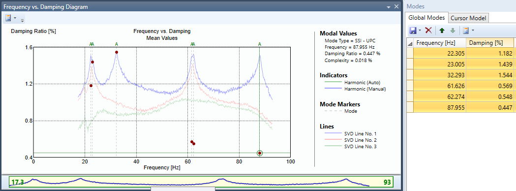
The diagram works for all estimators that provide damping, and the red dots always represent the mean values of the natural frequency and the damping ratio as shown in the Mode List.
In case the modes presented are estimated using the SSI-UPCX method, then the diagram also presents the confidence interval obtained from the covariance matrix of the natural frequency/damping ratio pair.
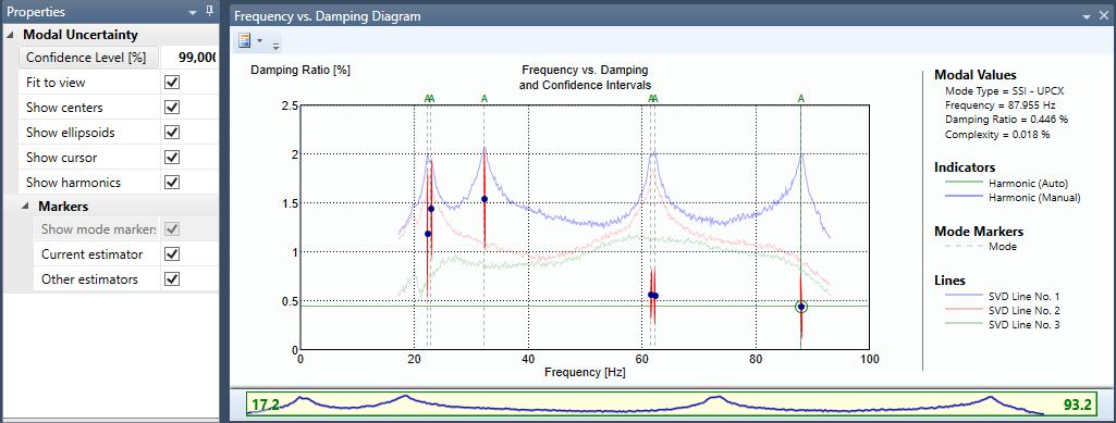
Now the mean values are represented by a blue dot and the confidence ellipsoid is shown in red. In the properties to the left the currently used confidence level can be controlled. In the above example this is set to 99%, which means that if the is repeated, then with a 99% probability then new results will be located within the area spanned by the ellipsoid.
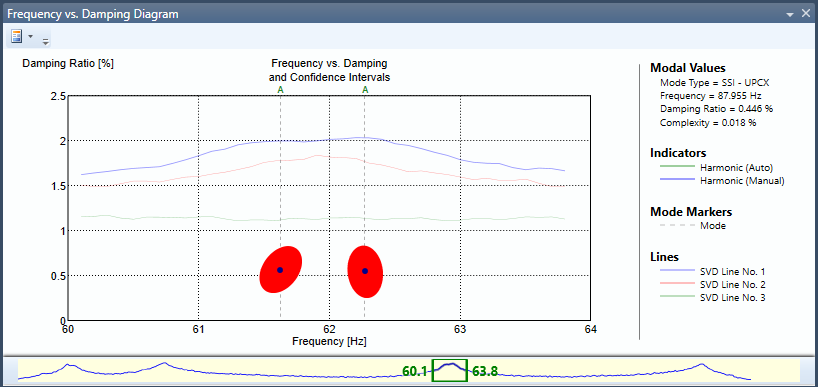
By using the zoom bar in the bottom of the window, it is possible to zoom in on specific modes as shown below.
See Also